🌟📊 Bridging Data and Geography: Excel Meets GIS 📊🌟
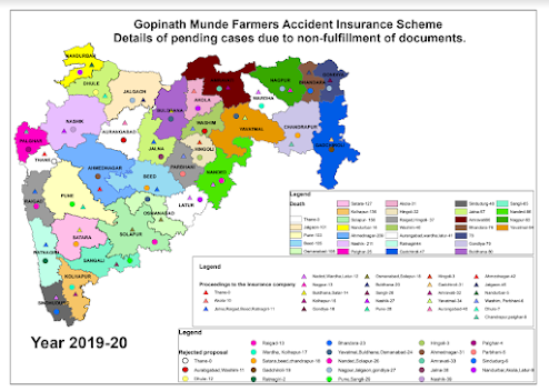
I'm excited to share a recent accomplishment where I turned raw Excel data from government departments into insightful legend maps using GIS tools! 🗺️🔍 Here's how I approached this project: 🔹 Data Integration : I meticulously aligned and joined Excel data with GIS shapefiles by matching similar fields across both datasets. This seamless integration ensured accurate data representation on the maps. 🔹 Map Creation : Using GIS software, I developed dynamic legend maps that visually depict the integrated data, highlighting key trends and metrics across various regions. 🔹 Enhanced Insights : The final maps offer a clear and actionable view of complex data, making it easier for stakeholders to understand and leverage the information for informed decision-making. By harmonizing data fields from Excel with shapefiles, this project showcases how effective data visualization can transform raw information into powerful, actionable insights.